Creating plugins and widgets for WordPress
Get unlimited opportunities to satisfy your ambitions and creativity
WHAT YOU GET
We help startups and small businesses create professional WordPress extensions. Use our service to develop plugins and widgets, and use the time and money you save to grow your business!
Created plugins and widgets
years in the field of website development and plugins for WordPress
Satisfied customers
HOW IT WORKS
If you have the desire to make an extension for WordPress, then you’ve come to the right place. In addition to the desire, you will need the following:
1
Proceed with registration
In the terms of reference must be as detailed as possible to describe all the functionality of the future expansion
2
Interface layouts
If your application is going to display and/or customize something, you must provide layouts that show it in detail.
3
You get the finished product
Even after the delivery of the project, within 30 calendar days we will make all comments and correct the results of the customer’s work free of charge.
WHY
We help startups and small businesses create professional extensions for WordPress. Already hundreds of thousands of startup businesses around the world – from coffee shops and pizzerias to stores and photo studios – have made their own extensions using our site. Use our service for the development of extensions, and spend the time and money you save on the development of your business!
We always meet deadlines due to our sophisticated project management system. We set only adequate deadlines, so we have time to do our work well.
We have been developing extensions for several years. During this time we have managed to do a lot of complex projects. Only experienced developers work in our team. They are passionate about their work and are constantly improving their knowledge and skills.

TAKE MORE WITH US
An integrated approach for effective promotion of your business
All of our projects have been thoroughly checked for errors and inconsistencies with the specification. We do everything right the first time and our clients love it!
Unlike many companies, we do not require you to pay 100% before the start of work. The main amount you pay after the end of the work. We trust our customers, and they trust us.
We believe that just having a plugin or widget will not solve your problems. Before we start developing extensions, we study the client’s niche and competitors. That’s why we create tools for business development!
News
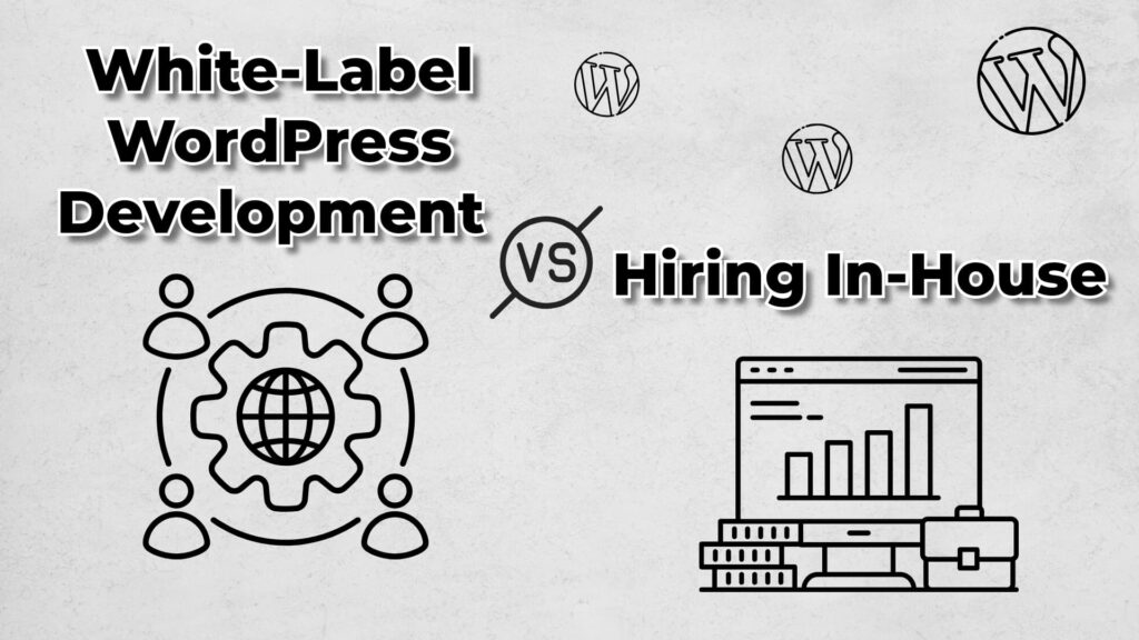
White-Label WordPress Development vs. Hiring In-House: Which Is Better for Your Agency?
Imagine this: you’re an agency owner sitting in your favorite coffee shop, sipping a latte that’s just the right amount of frothy. Life is good…except you’ve got three deadlines breathing down your neck, a client who just emailed you a list of “quick” updates, and a website redesign project that’s been sitting in your backlogContinue reading “White-Label WordPress Development vs. Hiring In-House: Which Is Better for Your Agency?”
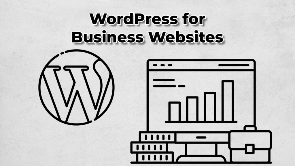
WordPress: The Quiet Workhorse Behind Every Business Website
Okay, confession time: I’ve been a WordPress fan for years. It’s not flashy, and it doesn’t try to be the newest, shiniest thing on the internet. But maybe that’s why it works. WordPress is like that reliable pair of sneakers you didn’t realize you’d been wearing for five years straight. Comfortable, dependable, and always thereContinue reading “WordPress: The Quiet Workhorse Behind Every Business Website”

The checkout page in website navigation design in 2022
Introduction to checkout page design The competition on the market seems to be higher than ever. With the breakthroughs in computer devices and lighting fast speed of internet connection worldwide, it became much tougher to stand out for businesses in the eCommerce industry. According to Shopify, the eCommerce market is as big as $5.55 trillionContinue reading “The checkout page in website navigation design in 2022”

Crypto Arbitrage Trading: How To Make Low-Risk Gains
Crypto arbitrage trading is a great way to make low-risk gains in the cryptocurrency market. By taking advantage of differences in prices between exchanges, you can buy low on one exchange and sell high on another, pocketing the difference. However, crypto arbitrage trading is not without its risks. The most notable risk is price fluctuations.Continue reading “Crypto Arbitrage Trading: How To Make Low-Risk Gains”

What Is A Node in Blockchain?
To put it simply, a node is a computer that connects to the blockchain network. In addition to validating and relaying transactions, nodes also store copies of the blockchain. And anyone can operate a node! Nodes are key to maintaining a functional network and deterring fraudulent behavior. How Do Nodes Work? Nodes validate and relayContinue reading “What Is A Node in Blockchain?”
Take a tour
We love what we do! If work brings joy, then new horizons and levels open up. We plan to improve continuously, to open new markets, to master technologies, to introduce progressive methods in order to take the leading position among the leaders.
We wish everyone good luck and prosperity together with our projects!

CONTACT US
and we will calculate the cost of your project for free
WE COOPERATE WITH

NFT games development and the creation of game metaverses with their own tokenomics, from leading blockchain developers.

PSD2HTML – web development services for small and medium agencies. Outsource white label web dev projects to a team of professional front-end developers.

Now there is a quick way to convert your heic photos to jpg format. Fast and free heic to jpg converter online.
Cloud Foundation Reviews corroborated my high participation where I was amazed by it. The trainers had a burning passion for their subjects and the teaching material provided was both informative and entertaining. I left with a feeling of joy and inspiration for applying the knowledge I gained. Thanks for all the wonderful times.
Snoopza is a powerful SMS tracker designed to enhance personal and business security by discreetly monitoring text messages, calls, and GPS location. With advanced tracking features, this SMS tracker helps protect families and safeguard business communications.

Enhance your location-based services with Navigine’s cutting-edge ultra wideband technology, providing unparalleled indoor positioning accuracy and reliability.

First, you’ll explore the top WordPress WooCommerce developers in US. Then, you will select and hire an agency that meets all your criteria. And the last step is that you can sell products online in just a moment. Here’s a quick way to success.